
pensole footwear design academy
Pensole is a professional academy founded by former Jordan Brand Design Director D’Wayne Edwards. With over twenty years in the footwear industry, D’Wayne has seen the ins-and-outs of product development for the biggest shoe brands in the world. Pensole also features a materials library containing thousands of color, material, and inspiration samples assembled by former Jordan Brand Material Designer Suzette Henry.
2015 FN platform challenge
The month-long course at Pensole was dedicated to developing brand concepts for presentation at the 2015 FN Platform, a global showcase trade show for footwear. FN Platform hosts over 1600 men’s, women’s, and children’s footwear brands.
At the end of the course, I was one of twelve designers selected to present their concept at the trade show in August.

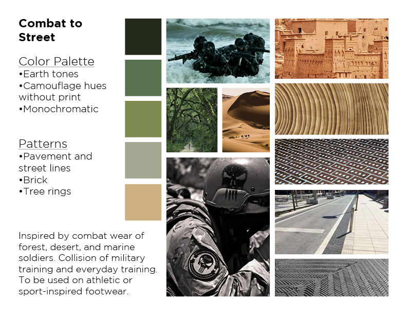
course entry SUBMISSION PROCESS WORK
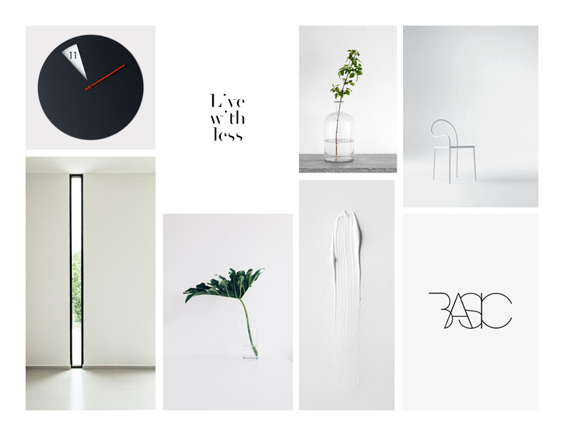
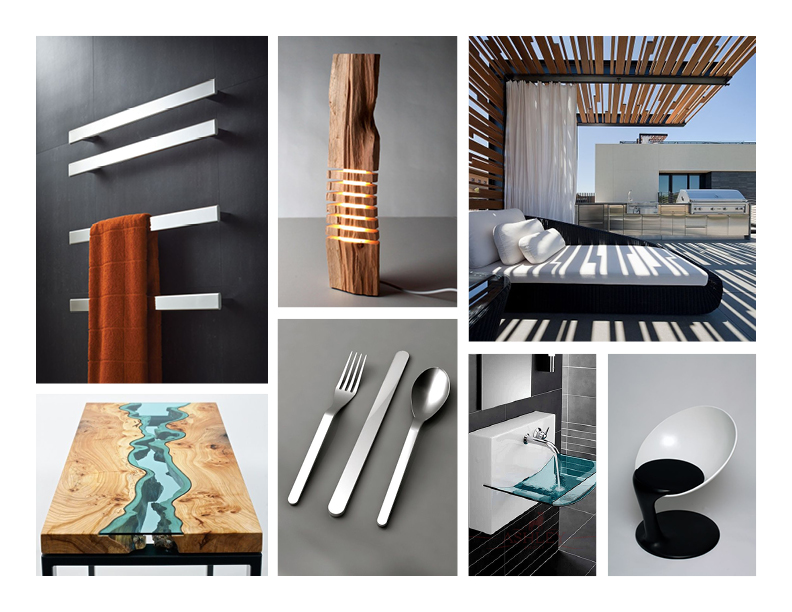
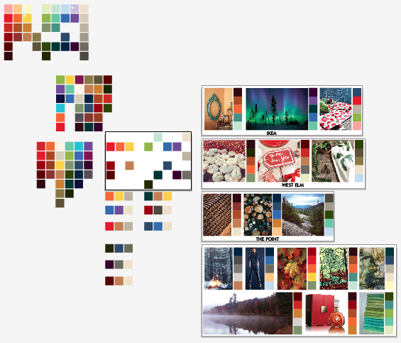
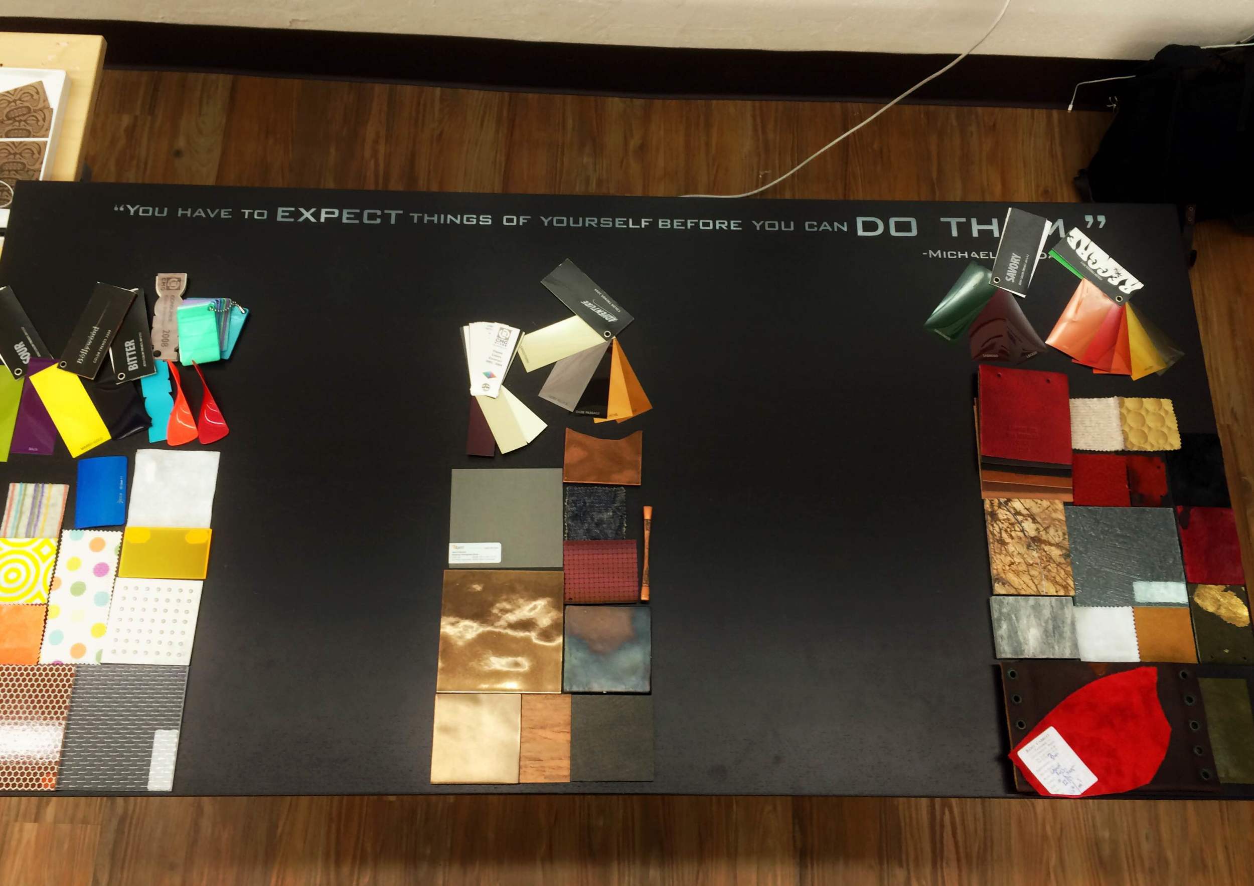
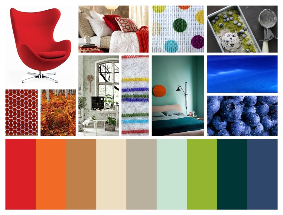
The above color and material palettes were created as I was working towards a final submission for acceptance in the course. After creating three unique directions, I gathered feedback from several color, material, and footwear designers in the industry to critique and develop my design submission.
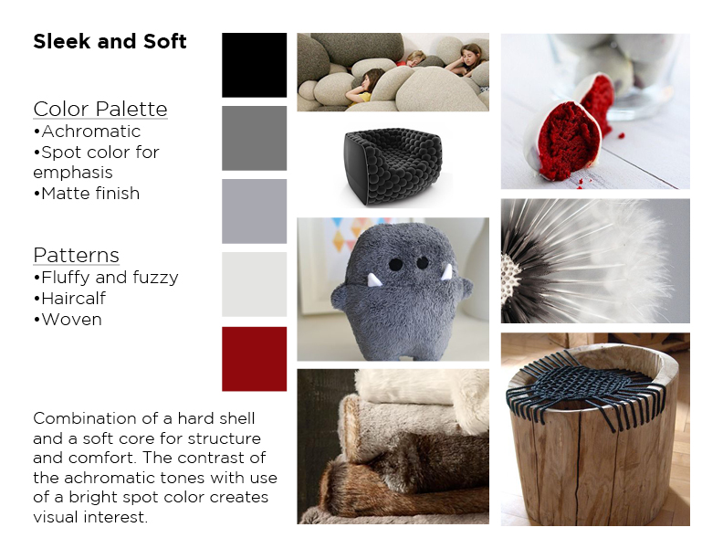
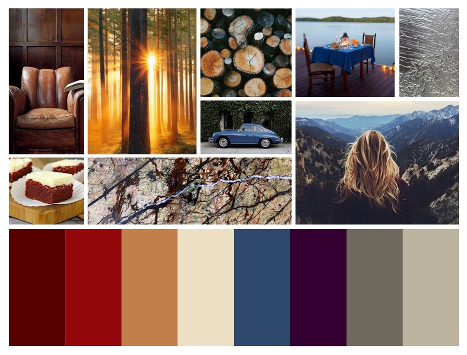
final Course entry submission
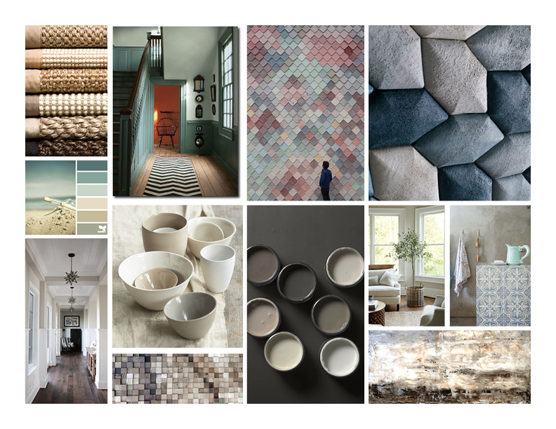
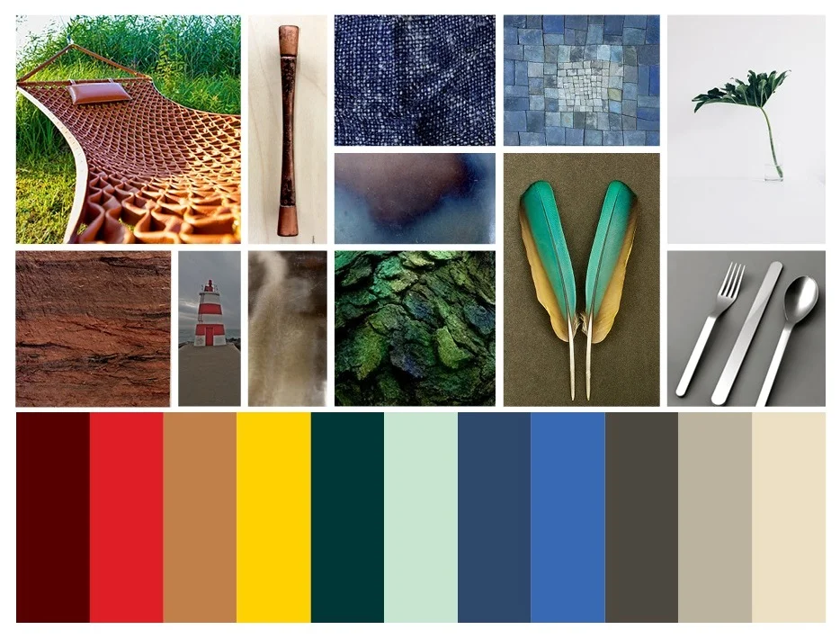
The palette above is my final submission for the 2015 FN Platform Challenge. After using a broad approach to the palette, I focused-in on specific materials and vendors, as well as Pantone color swatches and a stronger-defined story. My palette was chosen and I was selected to be one of six color and material designers in the class.
color and material design role
I worked on a team with three footwear designers and one brand designer.
Responsibilities:
- Influence footwear design
- Drive creative choices
- Define brand message
- Create global color palette
- Build selection for 9-12 unique color ways
- Organize and fill out team calendar
- Define theme and tell the story of the project
- Select appropriate materials for each footwear design
course project
Client: Woolrich
Design Objective: Redefine the house shoe.
Design Constraints: Each designer created a shoe inspired by or marketed for a specific distributor. One design was required to be for IKEA, one for West Elm, and one for a retailer of choice.

initial research
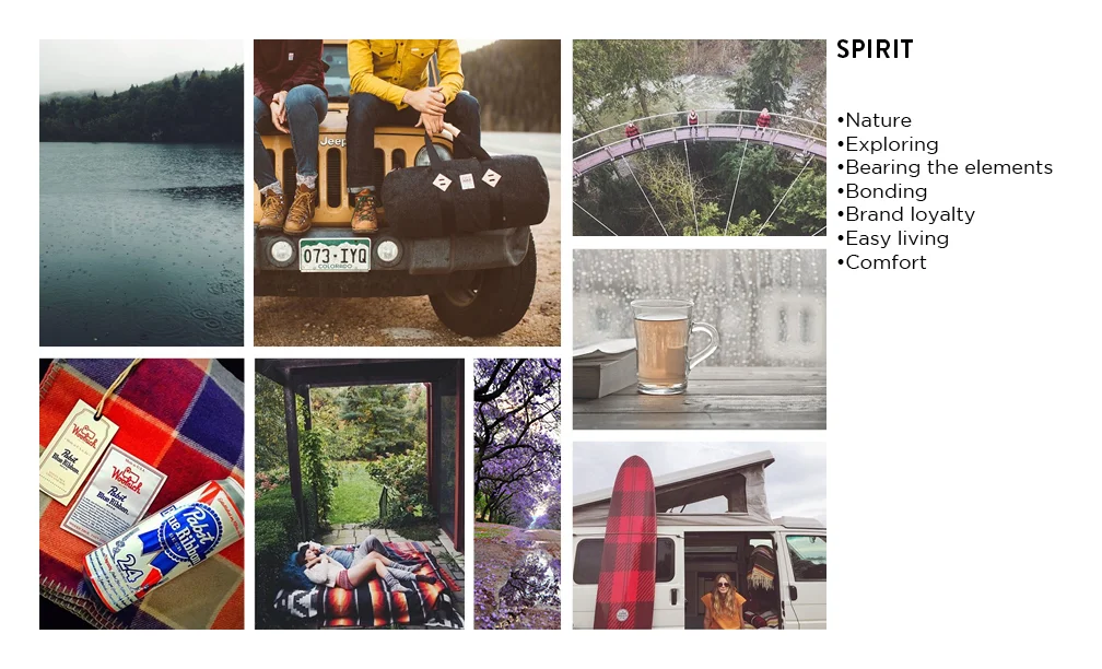
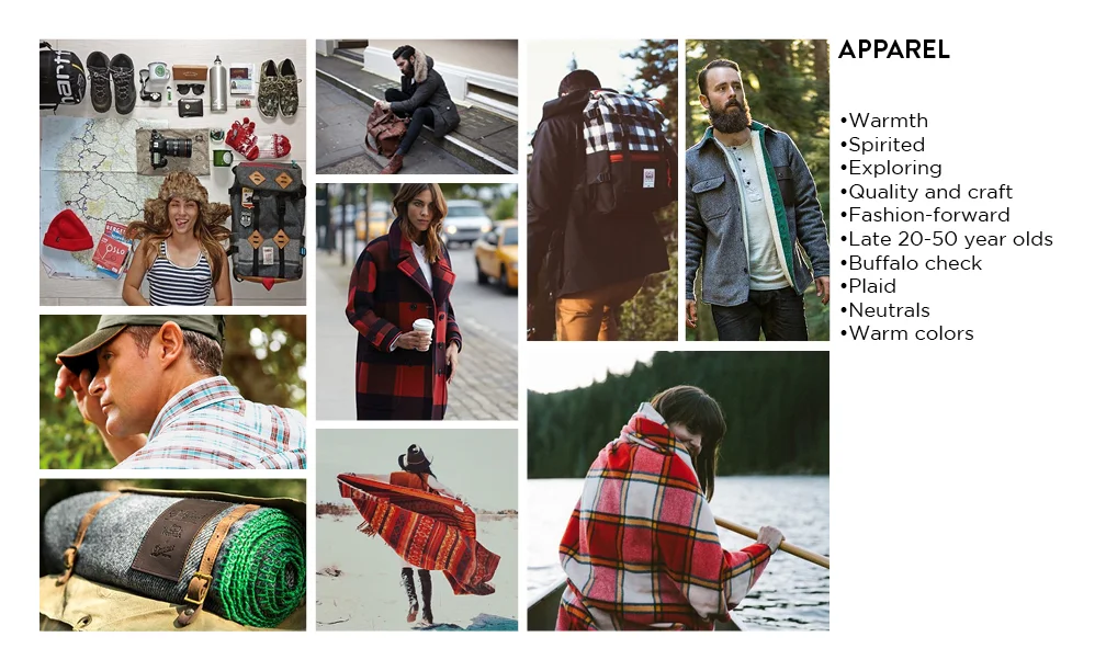
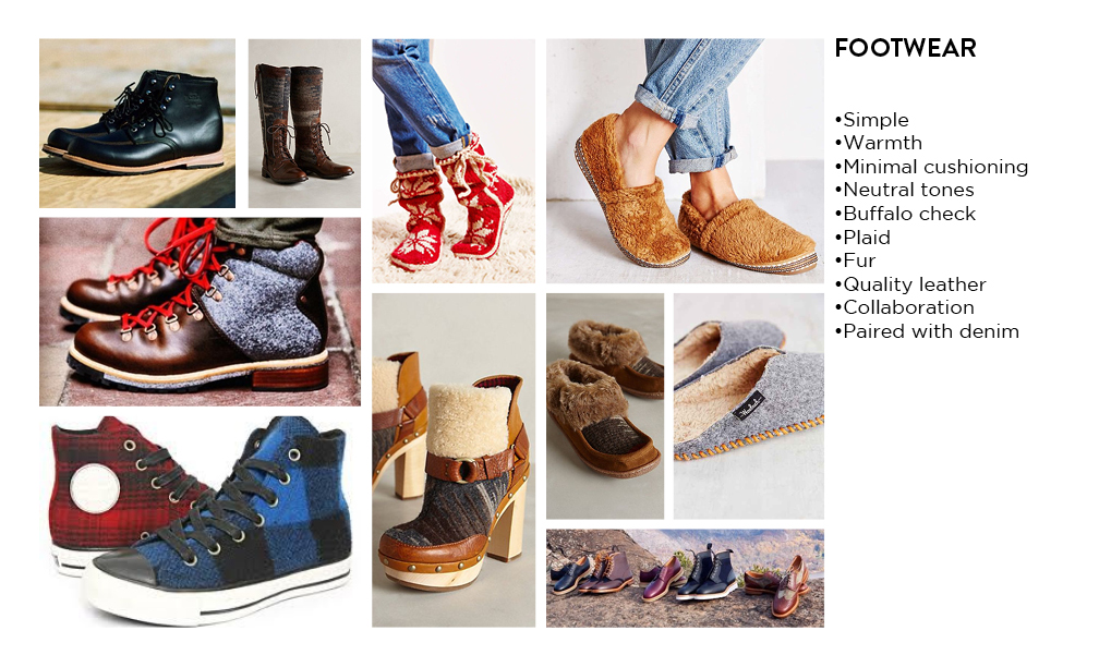
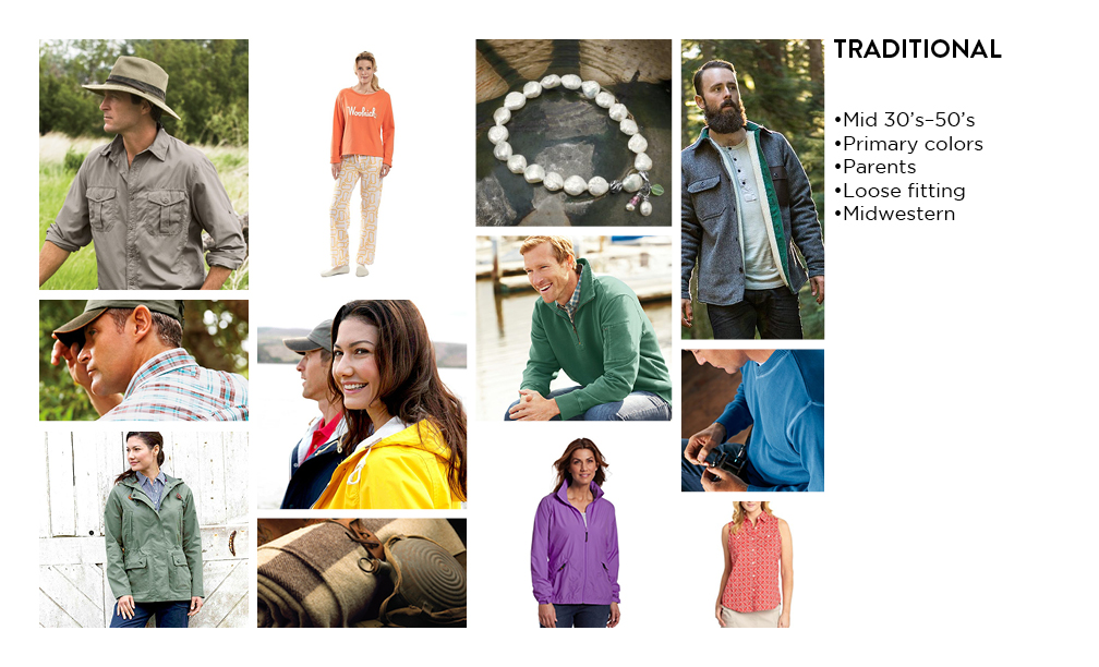
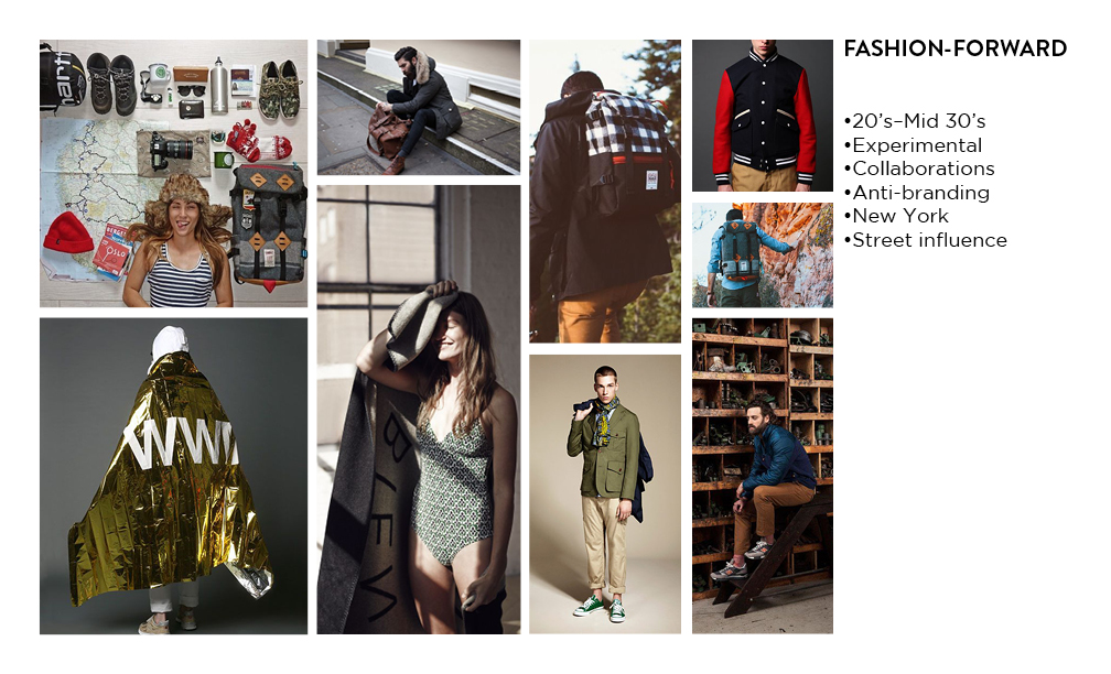
To begin my research, I conducted a visual audit of Woolrich. As part of the audit, I looked at the brand, and how it presented itself. I also looked at the spirit of Woolrich and the consumer that it marketed and designed its products for. In addition, current and past apparel and footwear products that the brand sold were also researched.
Within the current product, I found that most of the items fit within two categories: traditional and fashion-forward. After the visual categorizing, I plotted a potential direction for the brand to take its future products.
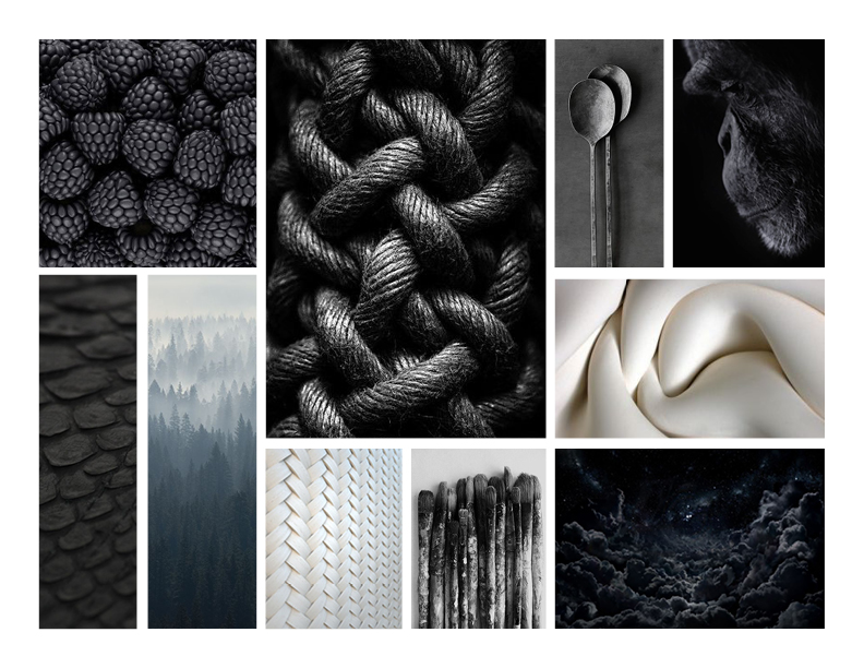

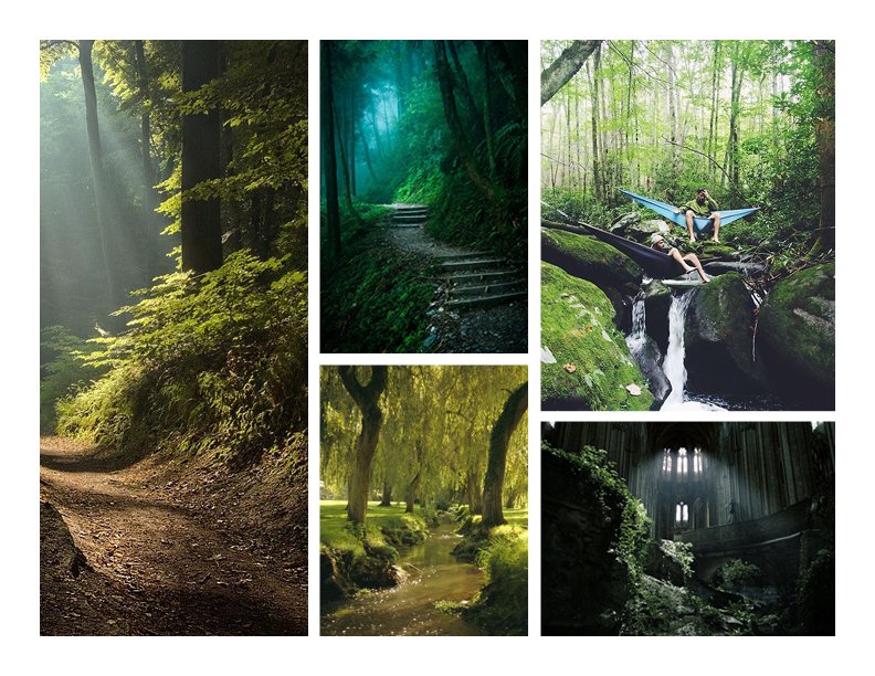
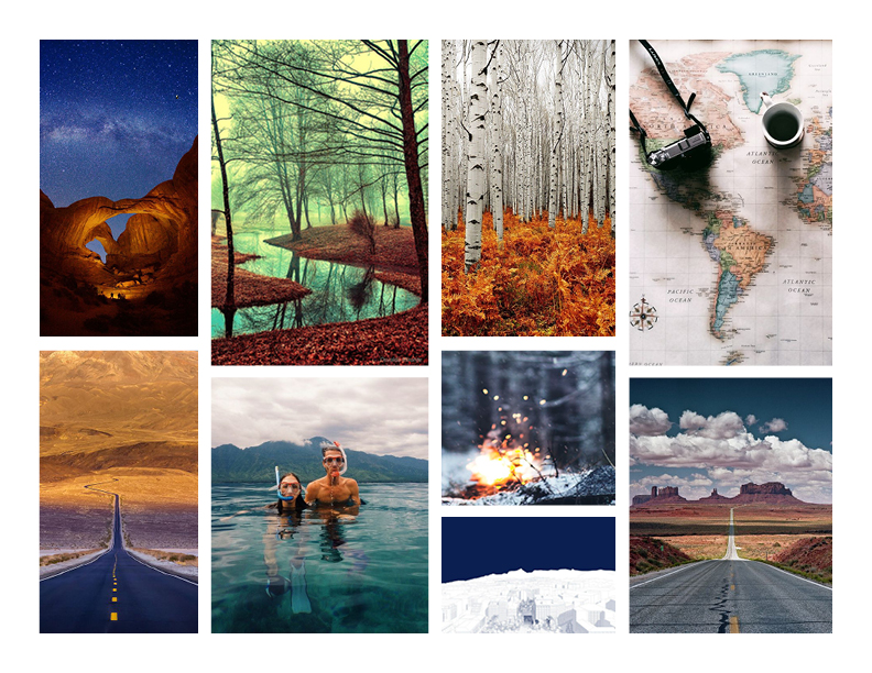
color imagery pulling
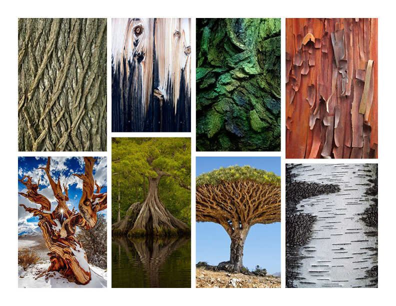
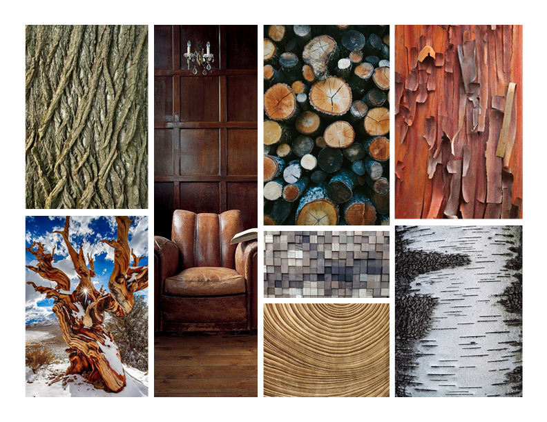
The visual audit of Woolrich provided a base of inspiration, which allowed me to pull imagery for colors that fit the brand. As I pulled imagery, I kept in mind that Woolrich is a tactile brand that prides itself in the quality of the texture in its products. As an outdoors brand, Woolrich designs its product to be used in awe-inspiring experiences. Each image in the initial color palette plays off of texture, experiential environments, or both.
The strongest color usage that I found in Woolrich design included
- Achromatic and grey
- Red
- Neutrals
- Denim
- Green
- Tonal complementary contrast


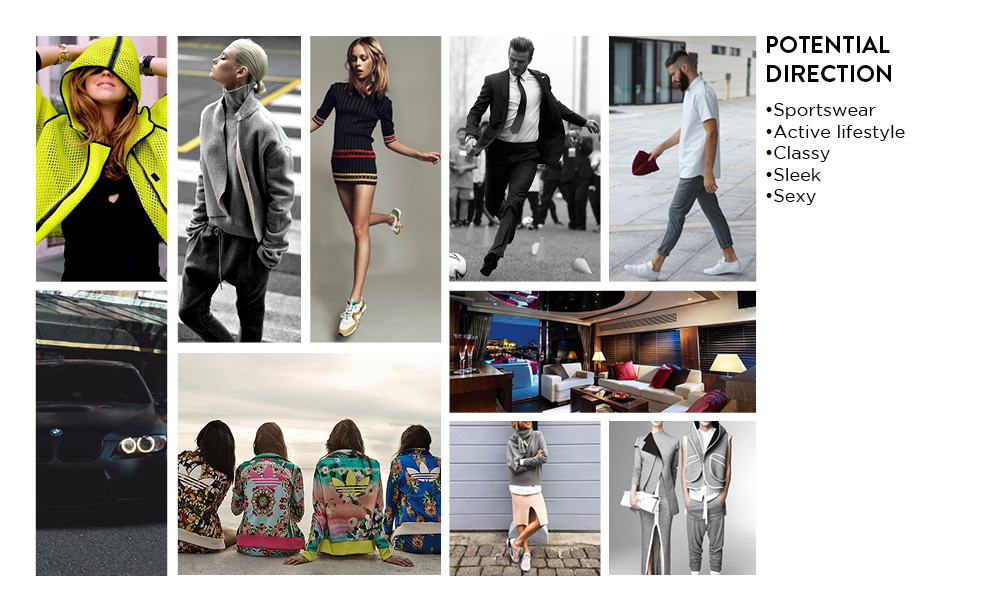
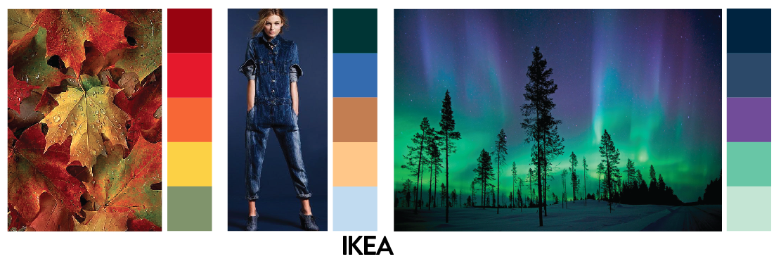
Ikea original direction
As a team, we built three different personas that the footwear designers would create the house shoes for.
After a pitch-back session and team discussions, we decided on a direction for the IKEA design:
- Elvira Lundell, 23
- Single
- $31k annual income
- Lives in Stockholm, Sweden
- Waitress at an American restaurant
- Student in culinary school
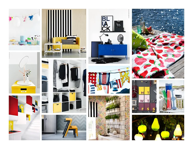
With the structure of the consumer laid out, I reused and continued to pull imagery that fit IKEA's brand. I looked for uses of bold color coordination, neutral tones, and unique and multi-use products in the imagery.

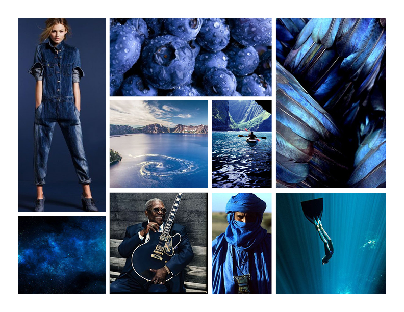
west elm original direction
After the pitch-back session and team discussions, we also decided on a direction for the West Elm design:
- Lisa Mitchell, 35
- Full-time mom of 2
- $200k household annual income
- Household duties and errands
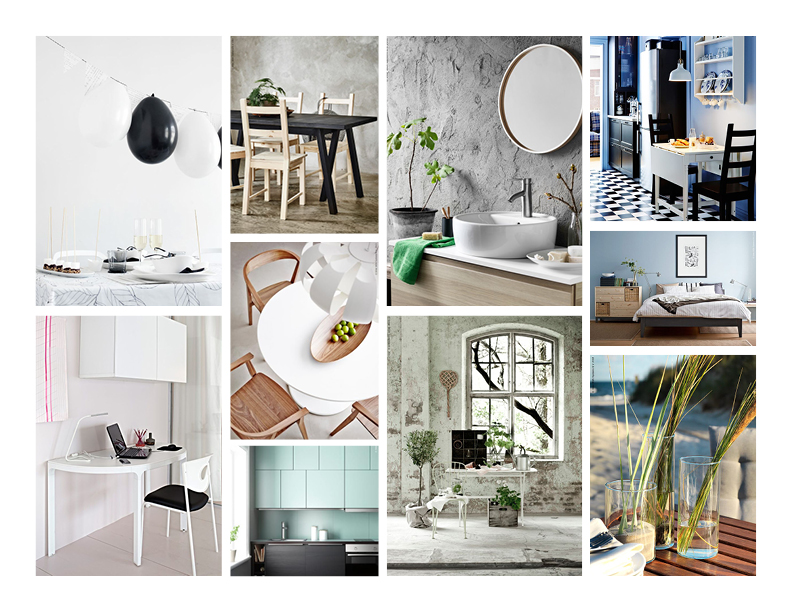
The imagery pulled for West Elm included textiles, minimal and modern design, neutral color palettes, and the use of plants and trees.

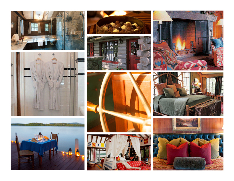
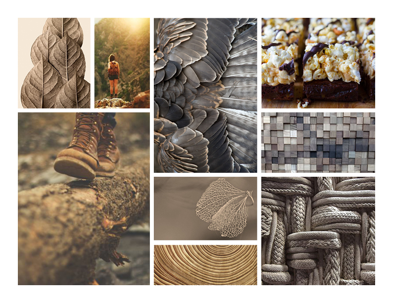
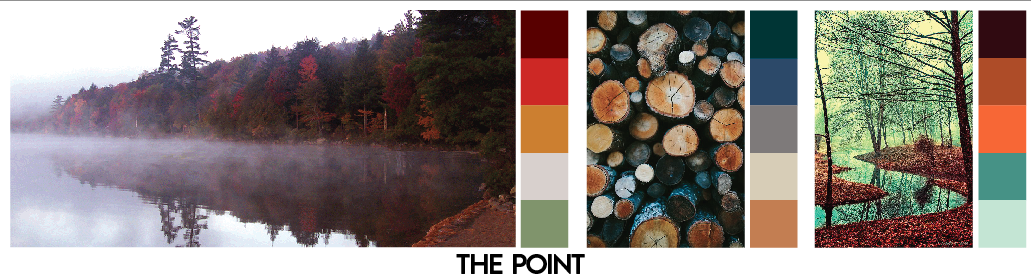
the point resort original direction
As a team, we decided that the third distributor would be The Point Resort in the Adirondacks. The Point offers a luxurious experience in cabins that were built by the Rockefeller family. With prices starting at $2500/night, The Point met a need for a high-end house shoe.
After the pitch-back session and team discussions, we decided on a direction for The Point design:
- Zara Castro, 29
- $1.5mil annual income
- Young, sexy bachelor
- Owns a men's accessories boutique in New York
- Looking for a weekend getaway
The images initially pulled for The Point design feature a heavy influence of wood and natural textures, as well as experiential outdoor scenery and cozy interior spaces.


sketch round one color-ups
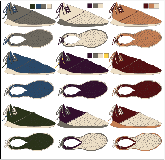
After receiving some initial sketches from the designers, I started working with coloring-up the line art. At the time, I was still defining a color palette and had about thirty colors to choose from. Even though this first round of sketches was nothing close to the final designs, I was able to explore color blocking and material mapping.

building colors and materials
The color-up investigation led me to building color ways. For each distributor I explored three color ways: one for fall, one for winter, and one for spring/summer. I used inspirational imagery that fit the distributors and colors that coordinated with a pop hue.
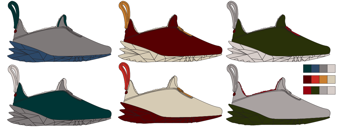
sketch round two color-ups
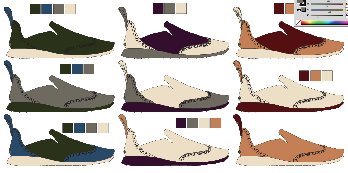
The above color-ups are based on sketches for The Point footwear design. I developed three unique color ways and applied them to two of the designs that the footwear designer created.
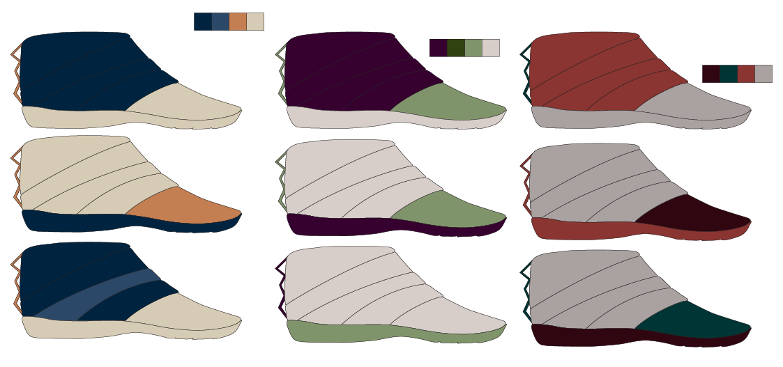
final color palette
The final color palette featured a variety of warm and cool colors. Most of the inspiration was from nature, connecting with Woolrich's brand ethos. I continued to only use imagery that featured tactile effects and experiential environments. Many of the color names were inspired by nature and the final color ways.
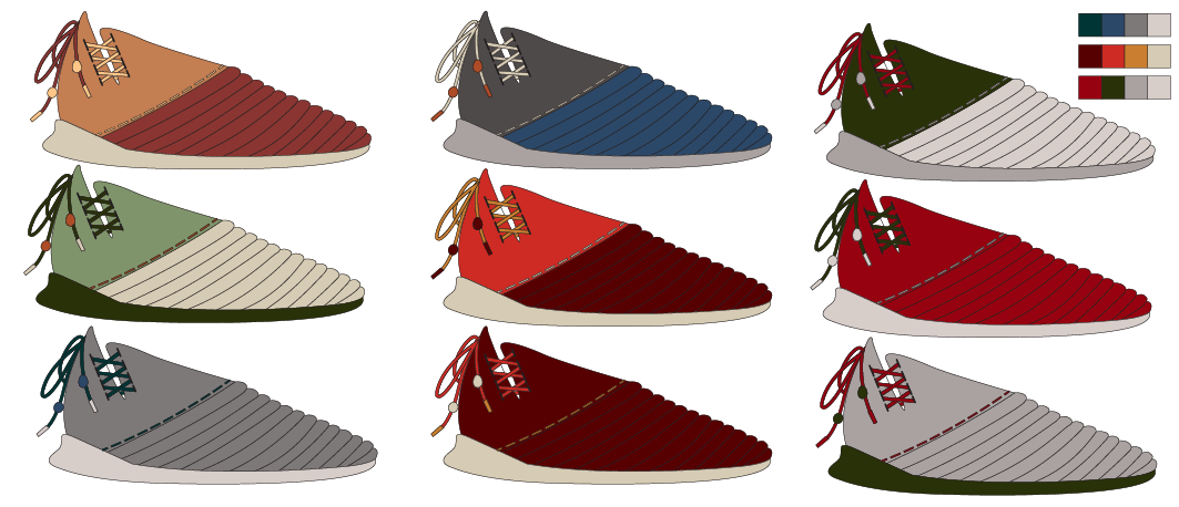
ikea final design – woolrich uppliva
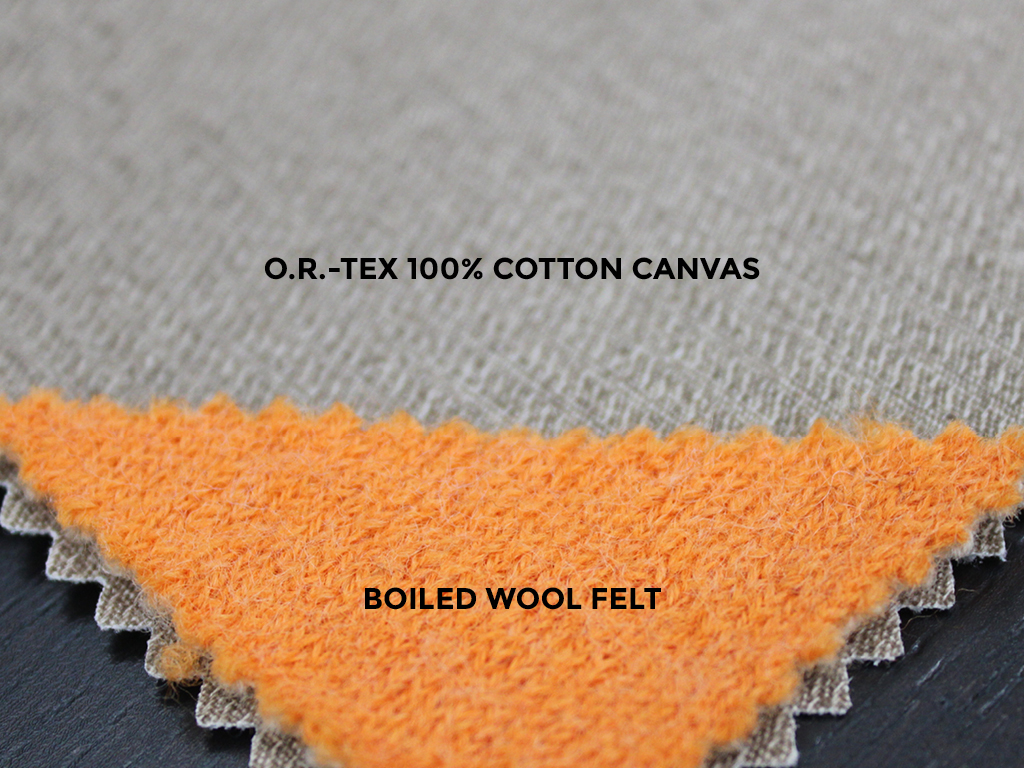
Above is the final design and specifications for the Woolrich Uppliva, intended to be sold at IKEA. The footwear designer was inspired by scandinavian furniture and design for this model. The Uppliva was ultimately designed as a unisex model that reached a $50 price point. For the color ways, I selected two interior spaces that fit the look of IKEA, as well as a fun food-inspired option. The materials were selected based on the simplicity in the shoe model. Boiled wool felt lining gave the model warmth with breathability and the canvas upper supplied structure and form. To help tell the story, I created 3D graphic renderings in Adobe Illustrator.
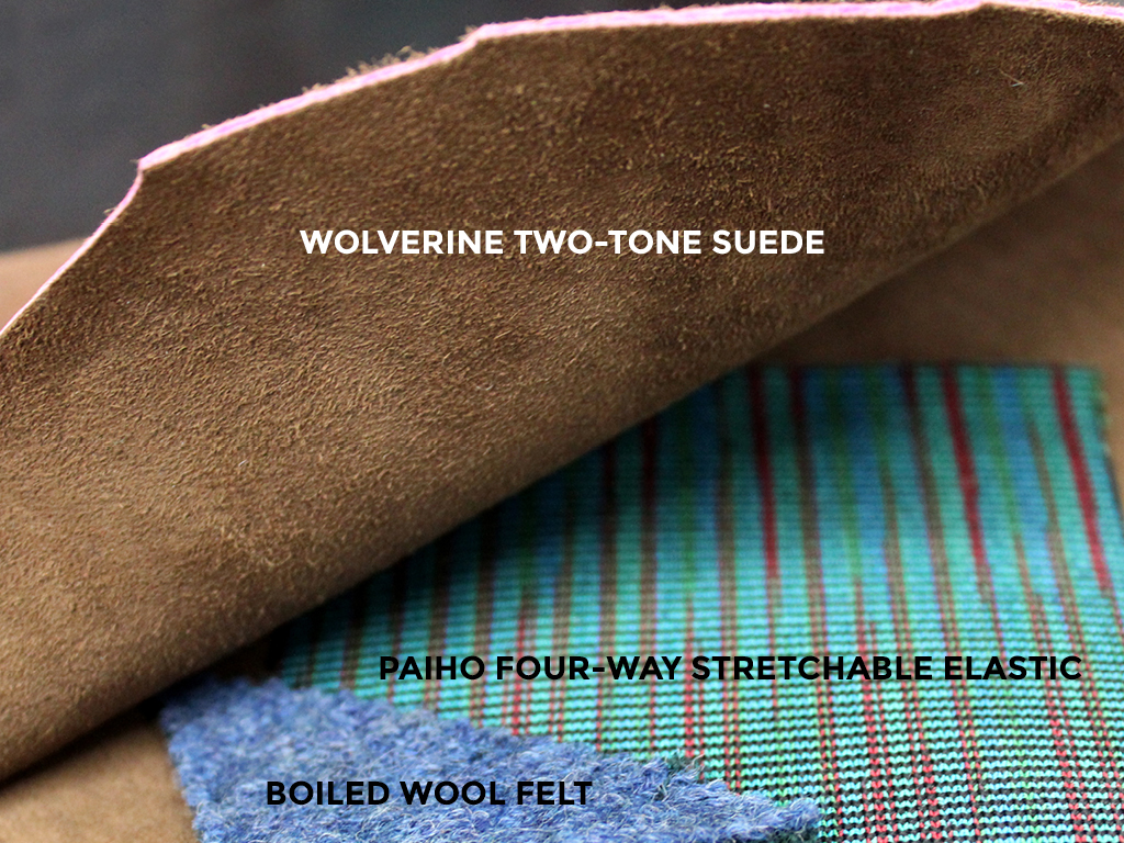
west elm final design – woolrich haven
Above is the final design and specifications for the Woolrich Haven, intended to be sold at West Elm. The footwear designer was inspired by a Louis Vuitton leather hammock for this model. The Haven was designed as a women's house shoe at a $85 price point. For the color ways, I selected coastal influences after designer based her client on the coast of Northern California. The materials were selected for a comfortable stretch-to-fit structure. The two-toned suede added subtle detail to the woven upper and the accents of boiled wool felt complemented the suede. There was also an elastic gore on the medial collar for easy on and off usability and the insole featured Poron Vive foam. To help tell the story, I created 3D graphic renderings in Illustrator.
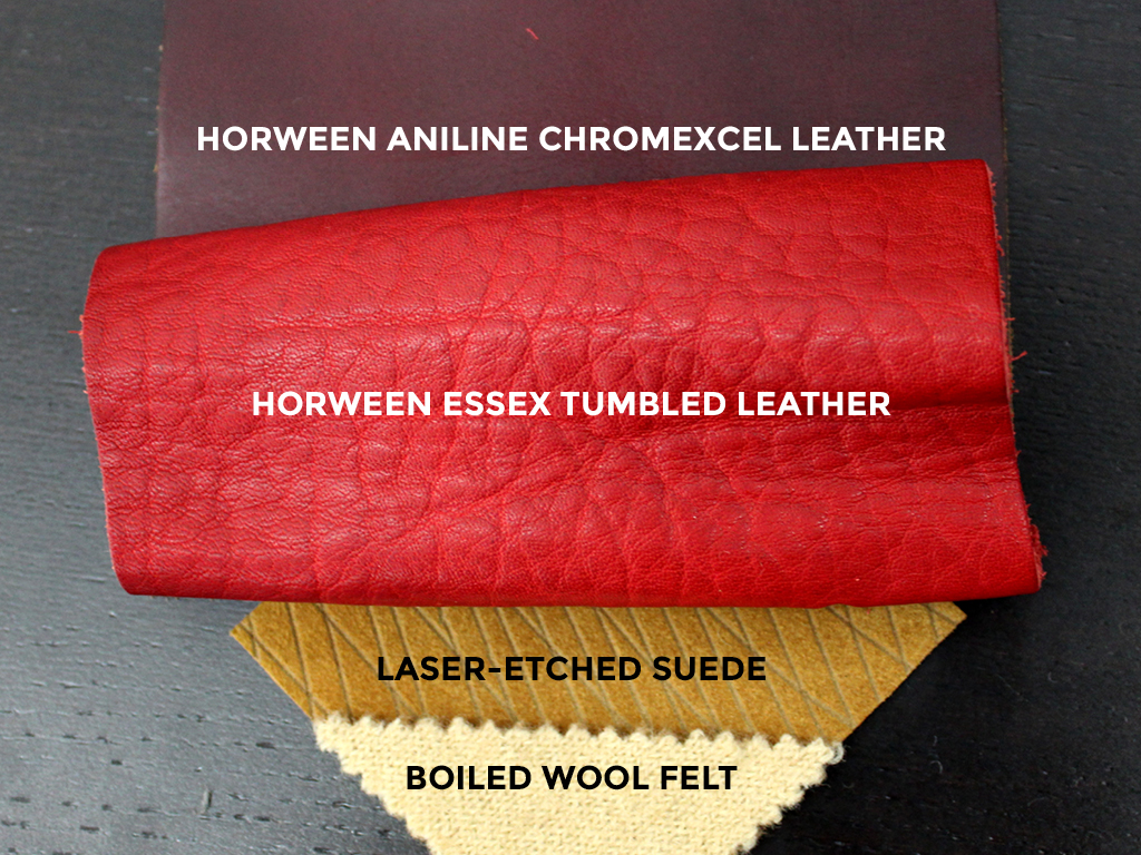
the point resort final design – woolrich american dream
Above is the final design and specifications for the Woolrich American Dream, intended to be given to guests at The Point Resort. The American Dream would also be sold at The Point's gift shop and released as a quickstrike through Woolrich. The footwear designer was inspired by Porsche design for this model. The American Dream was designed as a men's house shoe sold at a $300 price point. For the color ways, I was influenced by the luxurious lifestyle of the consumer. The consumer was traveling to The Point to propose to his girlfriend, and his weekend vehicle was a vintage Porsche. The selected materials were the ultimate luxury options with upper comprised of Horween Aniline and Tumbled Leathers, as well as laser-etched suede. The model was lined with boiled wool felt and featured plush Poron SRVSMA cushioning in the insole. To help tell the story, I created 3D graphic renderings in Illustrator.